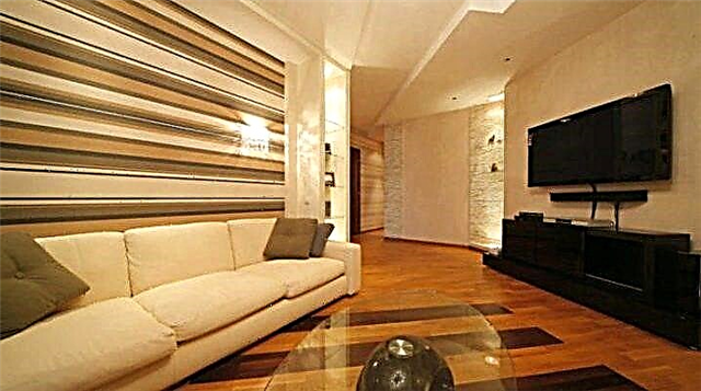
In design, there is such a universal solution for decoration, ideally suited for any style and purpose. We are talking about beige wallpaper in the interior - a gentle, cozy and comfortable option that can be left in a concise interpretation or diversified with bright details. About how to choose the right wallpaper for your space - in our article!
Beige Features
Coloring is one of the main visual components that form the atmosphere in the interior and the mood of people. Of course, it is important to be surrounded by flowers that match the taste preferences of the inhabitants. But it’s much more important to correctly organize the space, highlighting its advantages, hiding the shortcomings, and also fitting into the framework of the desired style.
Beige is primarily a traditional housing solution. If other, brighter shades appeared in the houses along with modern stylistics, then beige was present here since ancient times. It is ideal for classic areas, because in itself it has a characteristic noble charm and rigor.
But this does not mean that beige is rarely chosen in modern interiors. Here it is used to create a natural setting that gravitates towards nature and visual comfort.
Color promotes relaxation, rest, improves well-being, but at the same time helps to focus on important matters, without distracting attention. Do not worry that such a design will seem boring and unemotional - beige goes well with other options, and the palette of its tones demonstrates a deep variety of shades.
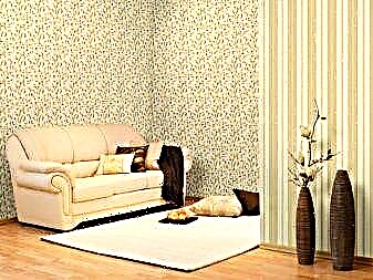
These include cream, nut, opal, caramel, biscuit varieties. Even if we confine ourselves to them only, we can create a comfortable space.
Types of Wallpaper
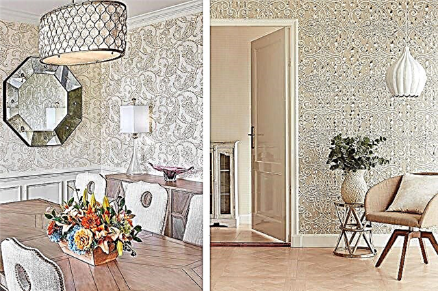
Wallpaper - this is perhaps the most popular option for decoration, which can be changed without damaging the wall. They differ in relatively low cost, practicality and visual variability. The construction market offers to decorate the interior with a plain design surface, a variety of prints, textures or colors, including the entire palette of shades of beige. But the main selection criterion is the material of the products, which affects the aesthetic and practical characteristics.
So, the most budgetary and most environmentally friendly look are paper wallpapers. They are single-layer or two-layer, rarely have a relief. Just five years later, a beautiful beige will begin to fade, the coating will absorb all the smells and be sure to peel off somewhere. The fragility can be justified by the cost, as well as simplicity in sticking.
Vinyl wallpaper is endowed with durability and moisture resistance. They lend themselves to repeated painting, hide the unevenness of the walls, but do not allow air to pass through. This kind can not be called eco-friendly, which is why it is not recommended to use it in the bedroom or nursery.
Non-woven wallpaper has practically no shortcomings, except for the high price. Products without a vinyl layer are completely harmless. They can be taken for gluing ceilings.
An unusual solution for any room will be liquid wallpaper, combining the best qualities of decorative plaster and paint. They do not leave seams when glued, do not collect dust, and also have a deep texture that diversifies and highlights even the palest shade of beige.
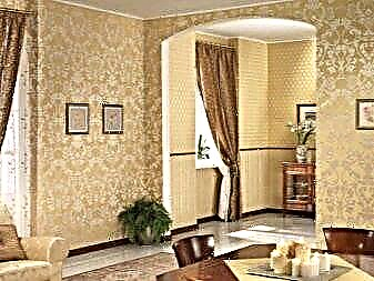
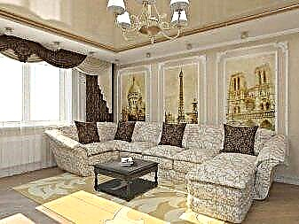
Low resistance to any type of pollution is characterized by textile wallpaper. But the coating of natural silk, linen, cotton or velor will decorate rooms with a stable microclimate. And in combination with beige color and floral design perfectly fit into the classic style.
Wall murals are not taken into account, since they are difficult to pick up in a beige interpretation. In general, the choice depends on the conditions in space, budget and the desired visual effect.
What colors to combine with?
Interior design is not limited to the use of beige wallpaper. They need to be entered in tandem with other elements, choosing a winning palette that emphasizes the calm nature of the color or diversifies it.
You can paste with beige wallpaper on one side of the room, and paint the others in more neutral or bright colors. An important role is played by the texture of matter and the pattern, which can be the main coloristic accent. Consider the main options for combinations:
Halftone and Monochrome Gamma
Such a combination involves the use of different shades of the same color, in our case beige. It offers the most comfortable palette for perception, in which, firstly, there are no bright inclusions, and secondly, there are a variety of natural variations.
Furniture with white or gray upholstery and curtains look harmonious against the background of wallpaper. It should be borne in mind if textiles have patterns, the wall covering should be monophonic, and vice versa. This will help balance the interior.
A wooden set will fit well, especially if it's light breed. Despite the fact that you have to work with one color, it is recommended to focus on tonal contrast: wooden objects - muted wallpaper, white objects - rich beige wallpaper with a texture.
Design
Design techniques for beige wallpaper based on the accentuation of texture or pattern. The texture is used where the number of interior elements is large. With its help, you can convey the mood, show the taste and personality. The print is necessary in rooms with a small amount of additional elements. Often, a design technique involves the use of paired materials, zoning the space.
Actual prints of beige wallpaper in demand in interior design are:
- imitation of relief for plaster and stucco molding,
- beautiful floral motifs with interweaving stems,
- objects of architecture (for example, with the Leaning Tower of Pisa),
- brown and gold monograms,
- various branches and leaves,
- blooming sakura and eastern national buildings,
- single flowers (e.g. roses, lilies),
- geometric figures.
Classical colors (striped wallpaper, cell and polka dots) are giving way to floral motifs today: all kinds of branches and leaves are in the spotlight. However, the strip is often an element of another pattern in which it shares the print of the pattern.
What are they combined with?
Beige wallpapers do not accept the combination of strong dark and bright colors: this simplifies the premium background and brings heaviness to the interior of any room. Vivid contrasts are acceptable as a small complement to a beige background. They can be an integral part of the drawing, but are unacceptable in a large volume, since thereby outweigh all the attention on themselves.
Therefore, with any combination, beige should dominate.
Fresh and fashionable beige wallpapers with mint and turquoise colors. Beige wallpapers are perfectly combined with light delicate shades of pastel colors (pale blue, peach, light orange, pinkish-gray, olive and other colors), nude tones, bronze with notes of pink color, a touch of cocoa with milk and coffee color. One of the successful techniques of decoration is the decoration of plain wallpaper with golden embossing, which in natural color looks a few tones darker than the base.

To fashionable combinations of beige wallpaper include a combination with:
Infusion of red and black contrasts into the composition is unacceptable: these tones destroy the grace of the shade.
Furniture
Beige wallpaper is suitable for different furniture. They will decorate any space, while the furniture can be of any shade, right down to the similar wallpaper chosen. No need to fear that the cladding and furniture may match in tone. In such cases, two methods are used to separate one from the other:
- highlight the accent area behind the arranged furniture with contrasting wallpaper (for example, paired, photo printing),
- choose a pair of tones that are lighter or darker than existing furniture.
At the same time, delicate contrasts are added to the space in the form of accessories of the decor. It can be drawings, paintings, curtains, a tabletop of a coffee or coffee table, poufs, a carpet, fresh flowers, decorative pillows, soft wraps, table lamp floor lamps and other interior additions.

With an abundance of light spots of design, dark touches are introduced into the spacethat can be made in brown or dark gray, steel, chocolate colors. Black color should be added to space with caution.
Furniture in white, cream, light and dark gray, lilac, sand and mustard colors, sofas and armchairs in lilac, blue, green, gray and blue tones harmoniously with beige wallpaper. Metal shades of a light color palette, wood tones will suit such wallpapers.
At the same time, it is important that the color of the wallpaper does not merge with the decoration of doors and doorways.
Curtains
It’s easy to choose curtains for beige wallpaper: they should not merge with the chosen color of the lining. However, the hue may be identical if paired companion wallpapers are purchased. In this case, a contrasting companion is glued to the wall where the curtains are located.
Do not try to pick up wallpapers and curtains in one picture: this simplifies the look of the interior. You can take as a basis the tone of furniture or bedding, decorative pillows, patterns of paintings.
The most successful shades of curtains in combination with beige wallpaper are:
- dark gray with white tulle,
- lilac with gold and a white veil,
- two-level chocolate and cream curtains,
- pink dairy curtains,
- lilac with a silver pattern,
- mint with beige print,
- beige with sand and blue pattern.
Which to choose?
Choosing beige wallpapers for a modern, classic or ethnic style of the interior, it’s worth noting a few simple rules:
- consider the style: for classics, pairing wallpapers with monograms, flowers are good, for creative design choose bright contrast with unusual texture to plain beige wallpaper,
- do not perform facing with one material: this technique is outdated and makes the design of the room boring (use two types of wallpaper in the pasting, complementing the material with a print with a monochromatic finish),
- if repairs are not planned within the next 10 years, choose between textile, non-woven, liquid or glass wallpaper: they are durable,
- in order not to suffer when gluing walls with a broken perspective, buy wide canvases for large areas, reducing the number of joints, and narrow ones for facing corners and small ledges (companies sell identical materials with different widths for these features of the walls),
- Paying attention to the drawing, note: it is visible from afar. Therefore, either step back a couple of meters from the deployed roll, if possible, or exclude from the shopping list wallpapers with a small pattern in the form of strips, cages, peas, guns, which will irritate the eyes and make you nervous,
- take into account the purpose of the room: for the living room (hall), wallpapers with monograms, flowers, stylization, silk-screened printing are advisable, it’s better to buy decoration in the nursery, according to age, it’s worth choosing appetizing drawings for the kitchen,
- if the walls of the room are low, use wallpaper with a textured pattern in the form of medium-sized stripes, sticking the canvas parallel to the floor,
- Plain wallpaper should be textured: this will give them uniqueness and indicate a special taste.
Stylish ideas in the interior
To see how stylish beige wallpapers are in the interior, you can refer to examples of design techniques for composing a composition:
- paired wallpapers with plain and striped embossed patterns are suitable for milk and blue furniture: they will look harmonious with curtains with a blue pattern and decorative pillows in a similar fresh shade,
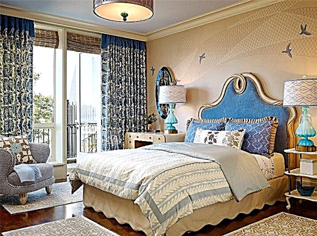
- Beige wallpapers with birds look great in the bedroom, decorated with blue curtains and gold decor: for the combination to be perfect, you need to complement the interior with two contrasts that are close to each (for example, the blue shade of the table lamp poles and the brown tone of the floor covering),
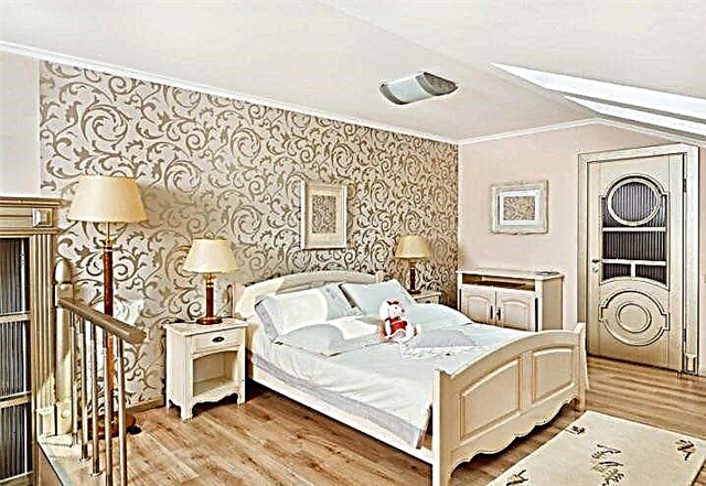
- bedroom decoration can be done in pair of beige wallpaper, pasted over the wall at the head with a canvas with lace, choosing monophonic coatings for other planes, adding honey paints in the shade of floor lamps to the interior, brown using the legs of the lamps, white using bedding,
- You can demonstrate the luxury of the interior with beige wallpaper with imitation of brickwork, decorating the accent zone with a molding or ceiling plinth, and making the rest of the cladding with plain paintings without a pattern.
See how to decorate a living room in classic beige tones in the next video.
Beige Nuances
Coloring is the main component that creates the atmosphere in the room and the mood of people. It is necessary to choose a color scheme that the owners of the house like. It is advisable to organize the space, hiding flaws and highlighting the advantages, giving the room a certain style.
In modern design, such tones are chosen to create a natural atmosphere that gravitates towards nature and external comfort.
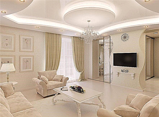
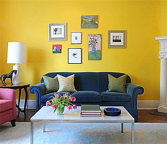
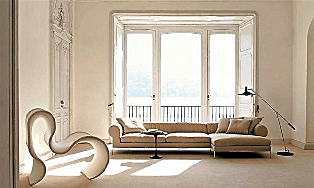
Beige wallpaper in the interior - a gentle, cozy and comfortable option
This color adjusts to rest and relaxation, improves well-being, while it adjusts to important matters and does not distract attention.
It is not right to believe that such a design is boring, not emotional. Beige color combines with different palette options, and the range of its shades and tones has a variety. It can be walnut, cream, biscuit, caramel and others.
Even if only one gamut is used in creating the interior, the room will become cozy, warm, while having stylish accents.
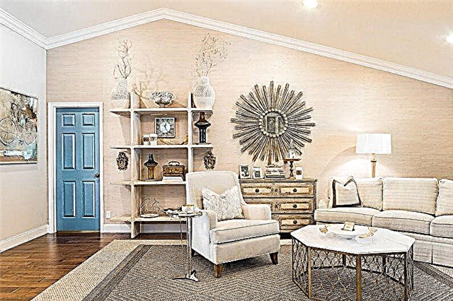
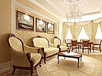
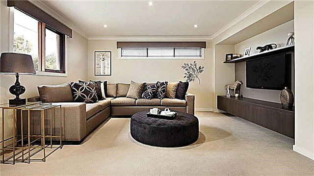
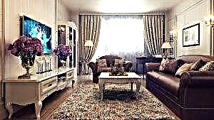
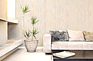
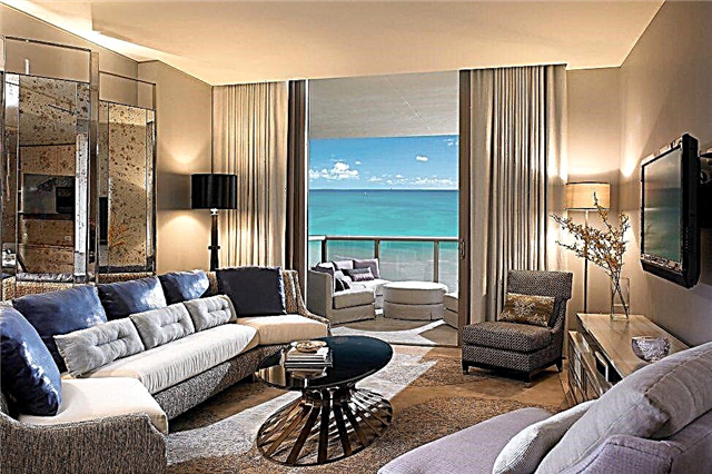
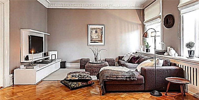
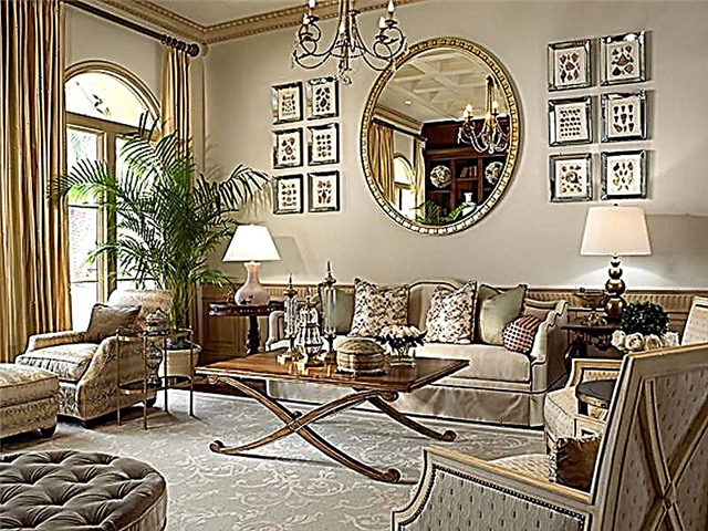
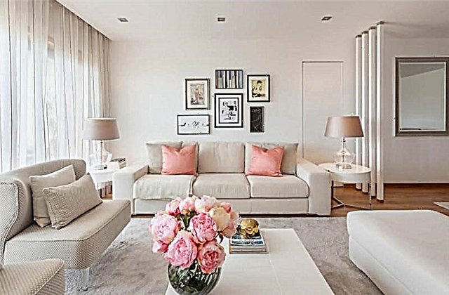
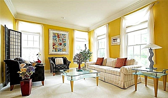
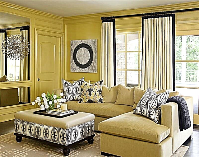
In the living room
Many traditionally create a guest room in beige tones. Designers recommend to use additional decorative elements, such as: to create bright accents and give the style of the room:
- overflows
- textured inserts
- bright blotches.
Inserts and panels from wallpaper with patterns will give the room additional solemnity.
Many traditionally create a guest room in beige tones.
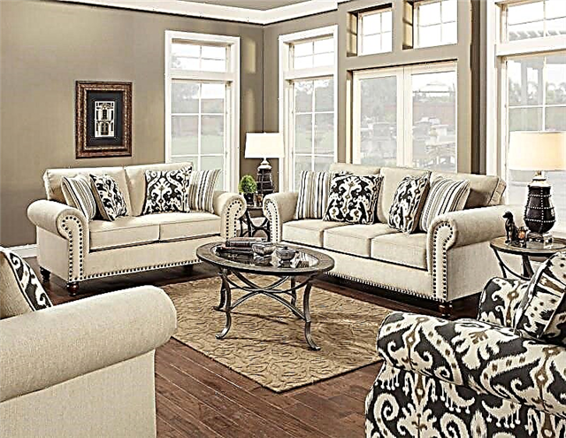
This gamut has various tones and shades that differ in saturation and some may be darker, closer to brown. For this reason, the tone of beige wallpaper should be selected carefully, for example, dark beige wallpaper will make the room visually smaller and not sufficiently lit.
The table, cupboard and other items can be in both dark and light colors. Upholstered furniture should be chosen that matches the bright accents on the walls, the style of the interior, the color of the floor, sometimes even the color of the curtains. The sofa can be light, dark or rich colors.
This color acts as a background
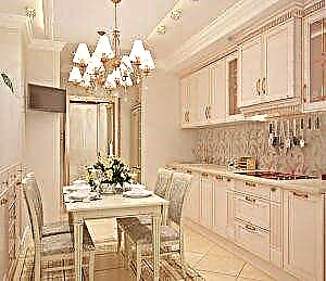
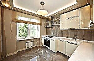
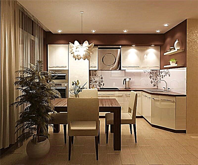
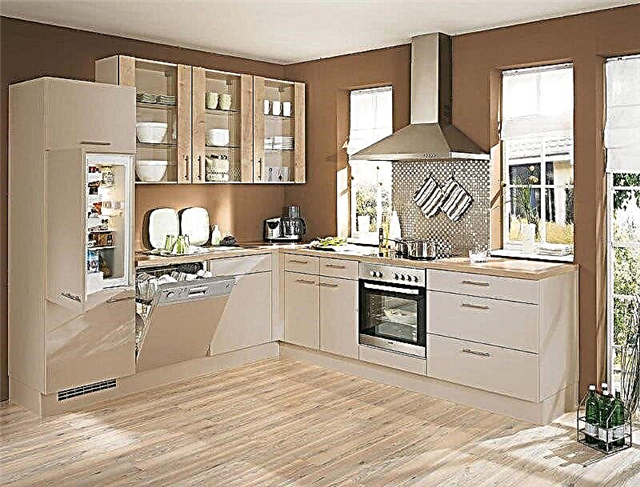
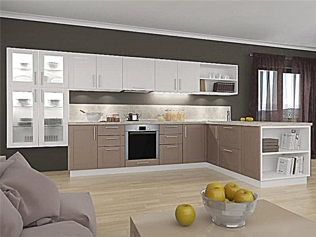
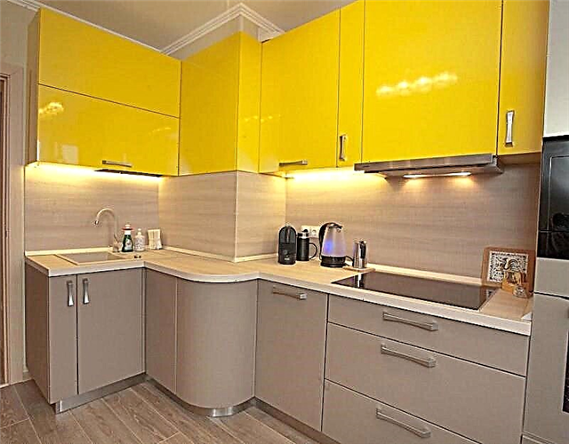
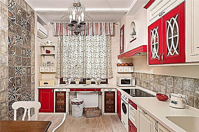
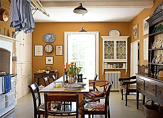
In the kitchen
Creating an interior kitchen, and especially the choice of wallpaper is quite a serious task. After all, the constant exposure to moisture and steam spoils the wall covering, and light shades on the walls get dirty quite quickly. For this, designers are advised to think carefully about all the advantages and disadvantages of wallpapering in the kitchen, after making a decision.
To create a positive, springtime atmosphere, beige wallpapers with warm sunny shades should be combined.
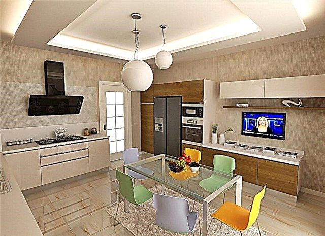
This type of wall covering provides durability and comfort.
The choice of the range of flooring depends only on the preference of the owners, it can be both dark and light. The general palette for the kitchen should be chosen in a more saturated range, so that the tones are more balanced.
Curtains in such a kitchen should be taken according to the rule of selection of furniture.
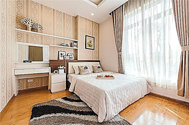
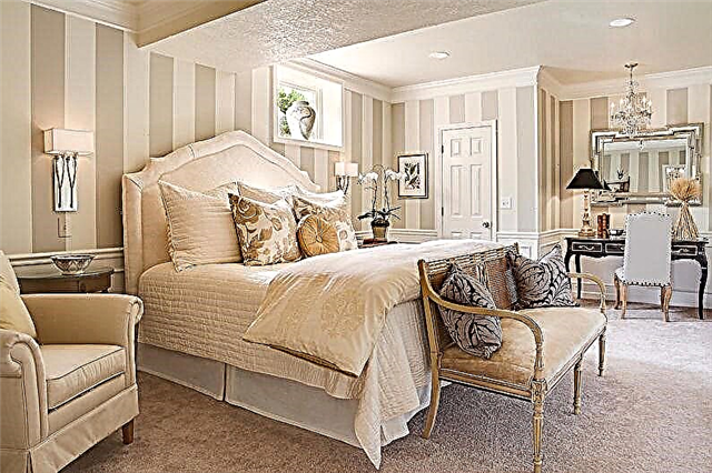
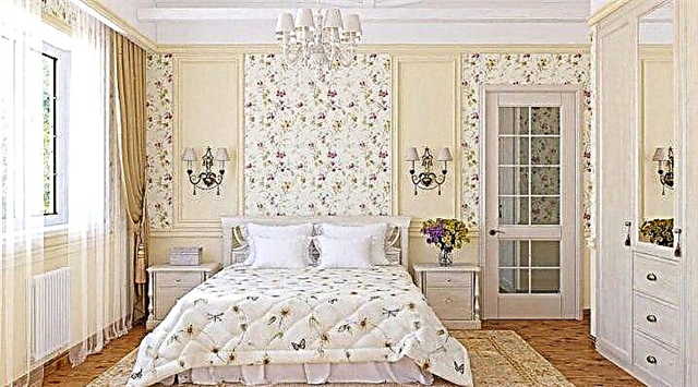
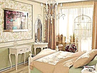
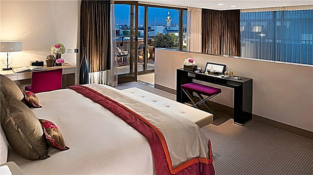
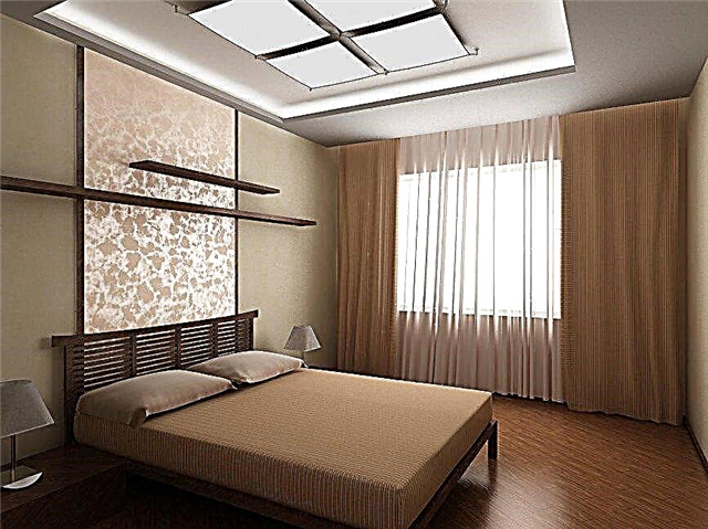
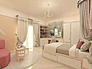
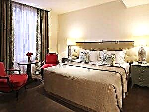
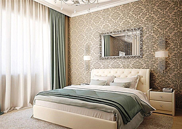
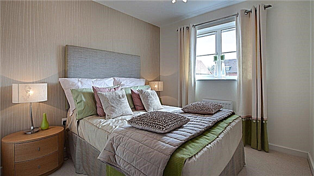
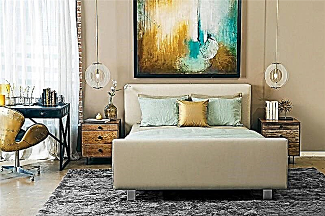
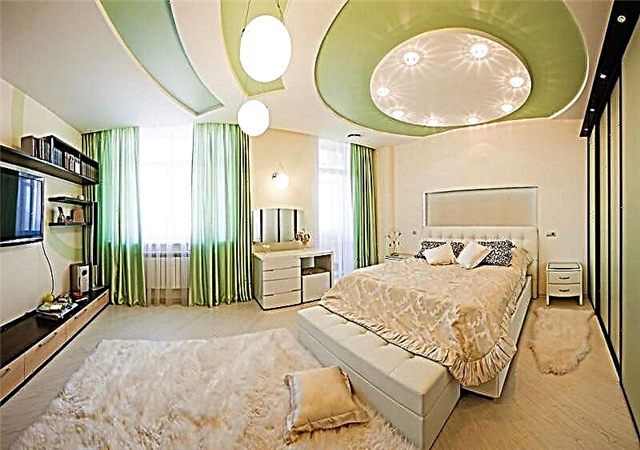
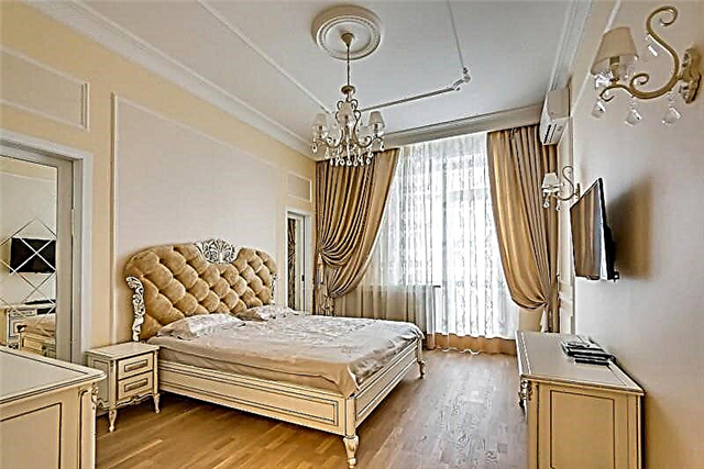
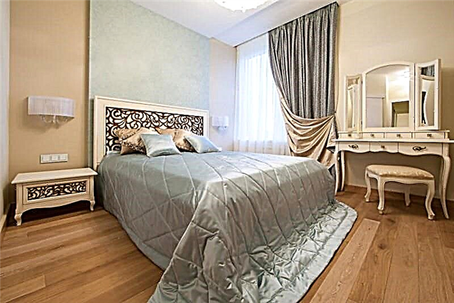
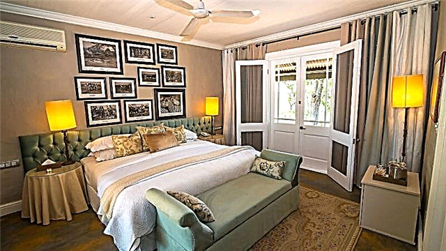
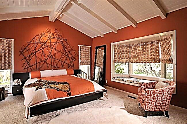
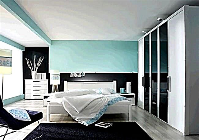
Beige gamma in the bedroom
Beige tones give the room coziness, warmth, tenderness and harmony, so designers give this gamut a special preference when decorating the bedroom. Wallpaper of this color is the most versatile and simple option.
Wallpaper of this color is the most versatile and easiest option.
The color of the furniture in such a bedroom should bring comfort. To emphasize the tenderness and lightness of the atmosphere, light or white tones in the headset should be preferred. Massive dark furniture or furniture of saturated colors will also be perceived quite harmoniously.
Curtains for the bedroom can have a different shade, the main thing is that they are combined with the style of the interior and be dense, so that morning sunlight does not fall into the room.
Curtains for a bedroom in brown
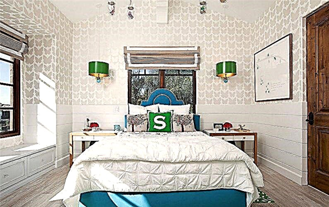
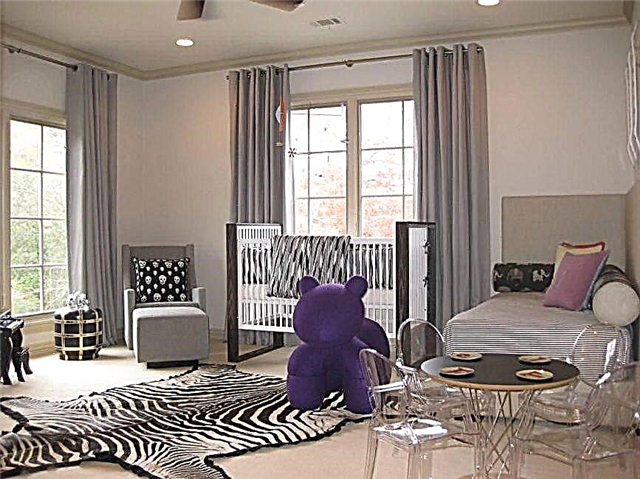
In the nursery
The beige color will be appropriate to look on the walls in the children's room, especially if its owner is still quite a baby. Thanks to the warm soft colors, the baby will sleep better and calm down.
The disadvantage of this palette is their soiledness. At a certain age, a child may want to decorate a room on their own, and wallpaper can become a canvas for creations. Therefore, designers recommend this color in the nursery for children under three or already in their teens.
The combination of beige wallpaper
Creating an interior is not limited to the choice of wallpaper. They must be correctly entered and combined with other design elements, pick up a palette that emphasizes the nature of the color scheme, and diversify it.
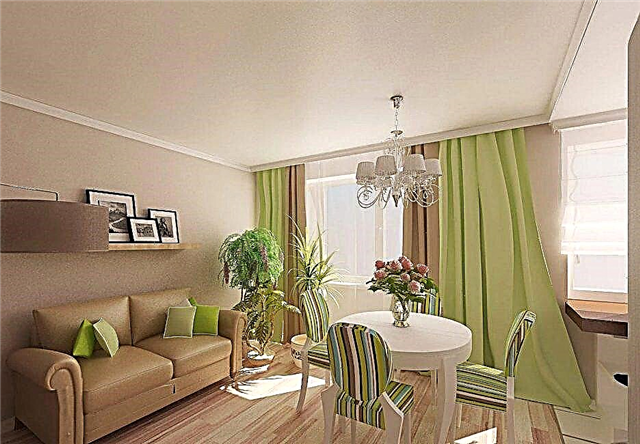
Bright green elements
The main methods of combination are:
- halftone and monochrome gamma,
- contrasting tones.
Monochrome Gamut and Halftone
This combination implies the use of different tones, shades of the same color. This helps to create the most comfortable palette for visual perception, as it does not have bright accents, but there is a variety of natural options.
Japanese style
Bright contrasting tones
The basis of this palette is the addition of bright elements to the design of the room. Contrast tones are quite noticeable on beige color, for this reason you should carefully select the combination.
Drawing on wallpaper of a different color should be present when decorating decor or textile. In other cases, you should focus on a beige semitone, which can be pink, peach or purple, which provides guidance for future searches.
Art Nouveau living room
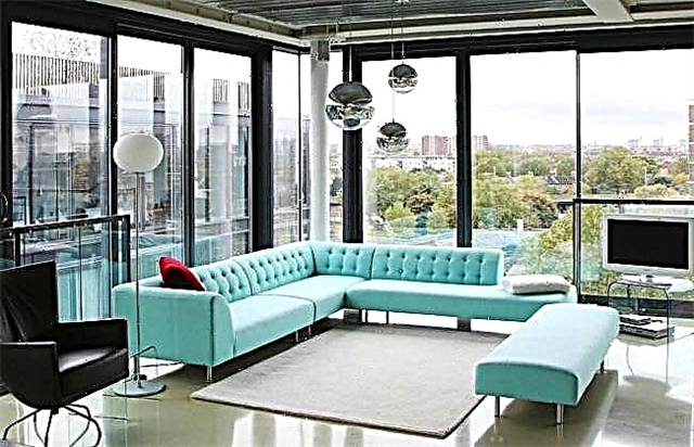
A cold shade of turquoise looks unusual against the background of beige wallpaper. This combination of colors gives the room a touch of freshness. Green accents will add a natural atmosphere that gravitates to natural landscapes. Pink on a beige background gives tenderness to the room, and red - warmth.
Bright contrast gamut should not prevail in space, otherwise the beige color will be completely lost.
It will be interesting for you:
Gray beige wallpaper
For people who are balanced and calm, an interior with gray-beige wallpaper is suitable. This palette gives the room coziness and creates an atmosphere of home relaxation. These two shades complement each other in contrast, while they are completely neutral.
If green accents are added to the interior with gray-beige wallpaper, then the room will become brighter and gain a charm. This combination has a beneficial effect on the human nervous system, calming it.
Gray-beige wallpaper will look appropriate when decorating a living room or bedroom.
If the room has non-standard sizes, then thanks to the correct arrangement of accents, the gray-beige gamut helps to give the room the desired look. For example, if the room is too wide, then the gray-beige wallpaper allows you to narrow it, visually it becomes the correct square shape.
Gray-beige gamma is most often found when decorating a room in the Scandinavian style.
Beige brown
Beige and brown wallpapers will look perfect when creating the interior of a kitchen or living room. When designing a bedroom, this gamut will also be quite appropriate.
With a sufficient amount of artificial or sunlight, the interior in chocolate-beige tones looks quite noble. Chocolate shade should be applied in the most prominent places, while the number of inclusions of it should not be large. Designers recommend this color when decorating baguettes of paintings, doors, plaid or pillows for a sofa in the living room.
In the interior of the nursery
Brown and beige colors complement each other and fill the room with comfort and warmth. This combination consists of feminine and masculine.
Striped beige and plot pattern.
Geometric ornament is used to increase the space of a small room, and to make the ceiling higher. For small rooms, designers are advised to choose light beige striped wallpaper, and in rooms with a large area should choose more intense colors.
Print wall
Wallpaper with a plot ornament is recommended to be combined with plain beige wallpaper or striped wallpaper.
Small abstract and geometric ornament
Stains, smears, lines and spots, which differ in intensity, are an abstraction. The pattern is randomly located on the wallpaper. This version of beige wallpaper will be a salvation when decorating uneven walls, since the elements of the ornament hide them.
Textured product in the bedroom
Small geometric shapes like squares, circles, and rhombuses also help hide surface flaws. It is recommended to use golden-beige wallpaper with such a pattern in the corridors or in the bathroom. This ornament does not reduce space.
With pattern
Beige wallpaper with a pattern emphasize the color scheme and create a stylistic solution to the room. Thanks to the ornament, you can create bright accents in the room and hide some of the design flaws.
Beige wallpaper with a pattern fits into any room and give it romance and lightness.
Bright, comfortable living room
For the classical style, beige wallpapers with overflows and gilding should be selected. This pattern on the walls gives the room a special luxury and charm. For a modern interior, on a calm warm background, products with a bright ornament are appropriate.
Positive aspects of beige wallpaper with a pattern:
- Easy to create accents. To do this, apply wallpaper with bright patterns, expressed in relief or with overflows.
- Simplicity combined with other elements like stripes, abstract or floral patterns.
- Products with gilded patterns and tints give the interior comfort and sophistication.
- The ability to visually change the space.
- Wall coverings with monograms are unobtrusive and easy to read.
- Models with monograms will help to betray the classic style of the room.
Beige color
Natural and versatile
Beige gamma for decorating walls is the right decision. It can be both a background and have bright accents in the room. Other tones will become central, and do not require additional elements. Such a palette brings the atmosphere of warmth, home comfort and elegance to the room. You can apply a wall covering of this color in different rooms, such as a living room, bedroom, corridor, kitchen, even a bathroom. They are appropriate when creating different styles in the room, both classic and modern. After reviewing the information, please leave your comments with reasoning in the comments. They will be useful to other readers. Your opinion is very important to us. Thank you for your participation. We appreciate your every feedback and time spent.
What styles can be used
The uniqueness of cappuccino as a color is manifested in the ability to mix and relevance for a long list of styles. Hue is considered a presentable version of brown, which is a real find for a modern interior. The color of cappuccino will not be superfluous in a glamorous setting, Provence and Loft styles, Art Nouveau and Classicism, mixed, in technological and ethnic directions. Pure brown, as well as white, gray and blue tones for all its popularity are inferior to cappuccino.
In a modernist design, a pinkish coffee shade emphasizes the intricate shapes in ordinary and dark brown tones, forms contrasts pleasing to the eye. Color suits the role of background. Thus, it is used in the interior rooms of houses in the style of classicism and baroque. The high-tech style uses plain glossy cappuccino furniture. In the lofts and rooms in the spirit of the province, coffee tones are combined with textures and textures.
Decor and accessories in a golden hue
Excessive use of a leafy shade in the decoration threatens to turn the premises into a stronghold of bad taste. Spot decoration of the room with elegant accessories affects the design exactly the opposite
Therefore, it is important to understand what the capricious golden color in the interior is combined with, and which decorations should be discarded. Elegant frames, a thick curtain or an air curtain with an unobtrusive golden print, exquisite tablecloths and other textiles can diversify the decoration and give the room a kind of “zest”
For a living room decorated in black and white, golden tall flower vases, which can be combined with a window curtain and decorative pillows for upholstered furniture, selected in a similar color, will be an ideal accessory.
Like paintings in golden frames, unique china with gilding is another way to complement the decoration. Such accessories play a special role in retro interiors, the main emphasis of which is aimed at emphasizing vintage and antique objects.
What colors does beige combine with in interiors?
As already mentioned above, beige can be combined with almost any other color, including white and gray, which, like beige, often act as the main ones, as well as black, which is a contrast.
White and beige interiors are appropriate where you need to create a calm, classic atmosphere conducive to rest and relaxation. Most often, this combination is used in bedrooms and living rooms.
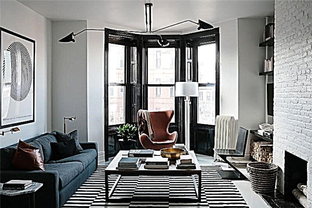
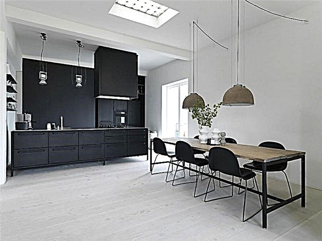
The black and beige interior is essentially contrasting and creates an active environment suitable for both living rooms and the kitchen, as well as utility rooms.
Gray-beige interiors are soft, calm, allowing you to relax - and at the same time having a pronounced "cold" character. Gray-beige color in interiors is used when windows face the south side, especially in low latitudes. This allows you to "cool" the atmosphere of the room, to give it restraint.
The combination of beige with other colors in the interior can be both soothing and bright, exciting. Depending on the purpose of the room, it is also necessary to select color combinations.
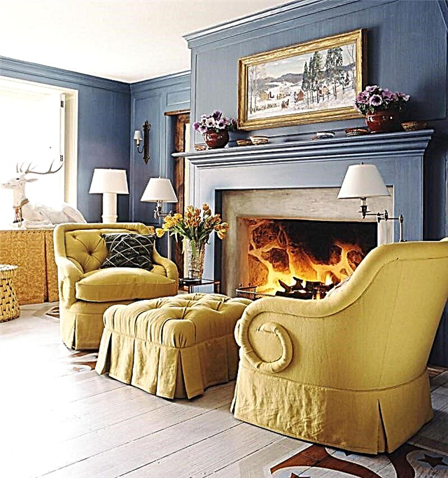
Beige and brown interior. The combination of these colors is the most natural and calm. Depending on the saturation of the brown tone, you can create a light, transparent design, or a contrast, filled with movement and energy. These colors are perfectly combined with each other, and the use of various shades and degrees of saturation makes it possible to create expressive, memorable living spaces.

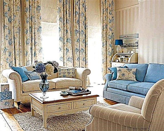
Beige and blue interior. Beige color goes well with a blue tint, the space visually increases. This option is suitable for living room, kitchen or bathroom.
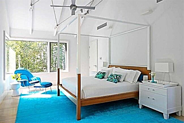
Beige and turquoise interior. Fresh turquoise is a clean, bright, joyful color. It creates a good mood, and therefore is often used in children's rooms. Beige in this pair acts as a balancing color that brings peace and comfort.
Beige and pink interior. A great combination for the bedroom of a girl or a young woman. Pink as an additional will create a romantic mood, and the main color will contribute to relaxation and good rest.
Beige and green interior. Both colors are natural, so their combination is very suitable for eco-style. Varying the different shades of both colors, you can get completely different designs to impress. Grassy green, olive, gray-green in combination with dark beige and complemented by brown furniture will create a feeling of a corner of wildlife and are suitable for the living room, and bright "neon" tones on a light yellow-beige background will decorate the children's room.
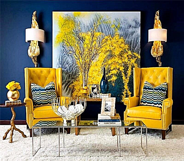
Beige and purple interior. This pair is suitable for modern interiors. It is very flexible due to the extraordinary breadth of the palette of shades of purple. Deep lilac in combination with beige will add contrast and brightness, delicate lavender - tenderness and peace.
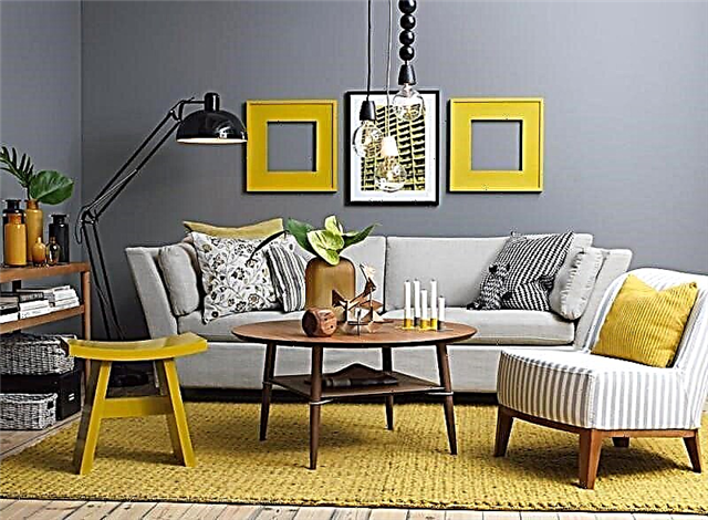
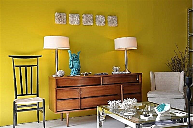
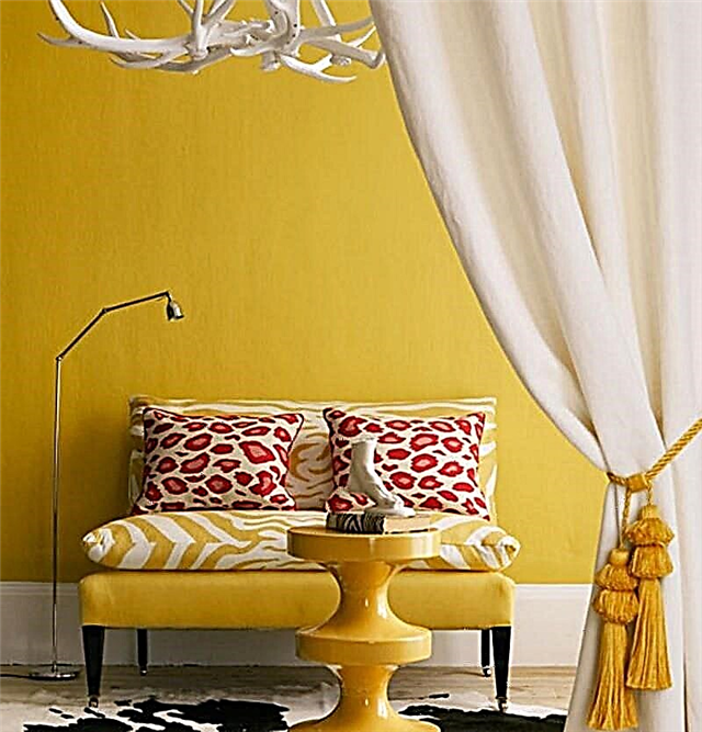
Beige and yellow interior. A rather vivid appetizing combination, and therefore appropriate for the design of dining rooms and kitchens. It can also be used in children's rooms, especially if complemented by green and blue color accents.
The combination of beige in the interior with other colors allows you to create really interesting and unusual designs that reflect the latest fashion trends and consumer demands.
Pros and cons of design
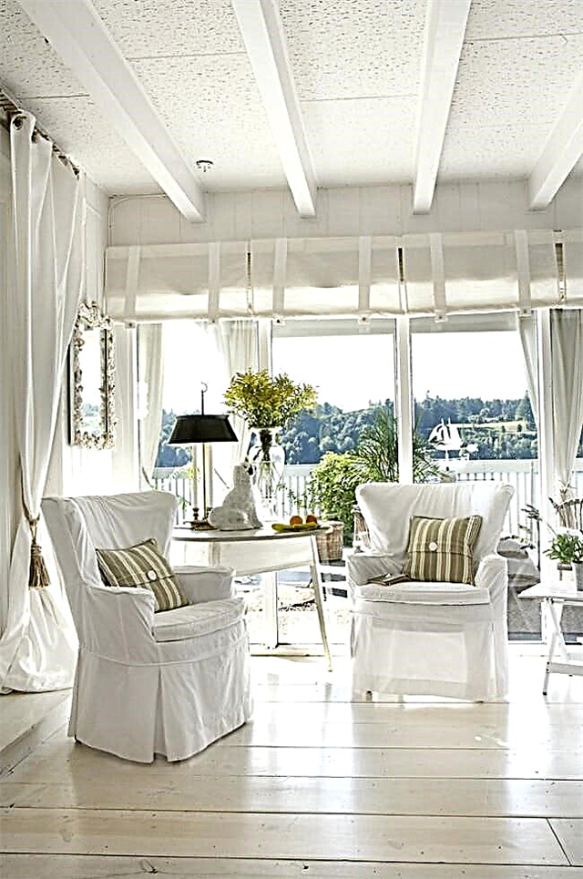
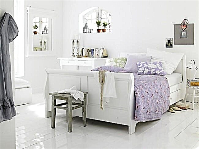
A small room will visually increase white
Living room seems larger if white tones are present
But an important advantage is the stylistic versatility of light flooring. Decorated in one color, the interior will illustrate the romance and airiness of rustic styles, minimalism and conciseness of modern trends. A combination of contrasting colors will help to give rigor and elegance: with small accents (skirting and cornices) or deepening of certain areas of the room (walls, doors, furniture).
Romantic bright room with access to the attic
Provence bedroom in airy white and purple colors
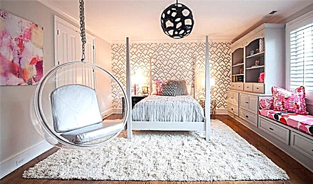
Bright spacious children's room in the style of minimalism
A small kitchen in which everything is in place and nothing more
White surfaces are not as easily soiled as deep dark colors (wenge, ebony, zebrano):
- dust is invisible on a white surface,
- shallow scratches and scuffs do not stand out as they appear with contrasting stripes on black wenge,
- traces of dried moisture or wet shoes you can find if they are exposed to sunlight at a certain angle.
Hallway with a white glossy finish requires careful maintenance
The disadvantages of the white floor (especially if we are talking about the monochromatic design of the space, including walls, furniture and the ceiling) include its coldness and some artificiality. In such an interior, there must be at least small juicy and bright accents. The combination of white is not limited in color: choose any colors and shades to revitalize the interior, give it the right atmosphere and your own, incomparable individual character.
White cold bathroom compared to a room decorated in dark colors
A bright kitchen with softer gray flooring and wood cabinets will make the kitchen more comfortable
Cold white high-tech apartment
Under the style of the interior
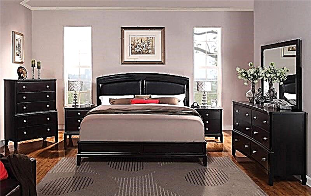
You will be surprised by the fact that dark shades of furniture, including black, began to be associated with something oppressive, mourning, only about two hundred years ago. People of the seventeenth and eighteenth centuries were inspired by white thoughts - it was the color of mourning, longing for the deceased.Perhaps that is why the classical style, in contrast to neoclassicism, is characterized by heavy, ornate dark furniture in the interior of deep wood tones. This also includes brown retro furniture of the thirties and forties of the twentieth century.
The philosophy of eastern, Asian countries calls the black source of wisdom, purity of spiritual impulses, good. Black furniture in the Arabic, Chinese interior is an ordinary occurrence. Carved dark furniture with a red undertones adorns homes that match Indian style.
For the trends of Art Nouveau, hi-tech, minimalism, a combination of such furniture with photo wallpaper is characteristic. The color of wenge dominates the Scandinavian, Provencal interior. Not so common in the domestic style of interior gothic, based on black.
Living room interior
The classic version is a monochrome version of the living room. The combination of light walls and dark furniture, sustained in strict tones, is the basis on which to build an interior with dark furniture of any style. The furniture can be represented as massive antique, antique stylized massive cabinets, or laconic glossy futuristic sets.
Upholstered furniture upholstered in dark colors deserves special attention: black, chocolate, dark gray. The surface of armchairs, sofas designed in such a range looks expensive, especially when it comes to leather. Only pet lovers should avoid dark fabric; traces of wool will be too visible on it.
Bedroom interior
Do not get carried away with dark colors to owners of small bedrooms, the smaller it is, the less dark furniture you can place. A bedroom of impressive size can be effectively divided into zones using black, asphalt furniture colors. A dark bed can be a key element in the design, light textile and plenty of pillows will emphasize its elegance. A contrasting bright bedspread with the same pillows will add cheerfulness. If you prefer a mysterious, intimate atmosphere, dark furniture is best complemented by mirrors in a massive frame, candlesticks, elaborate photo frames. The glamorous interior of the bedroom requires the dilution of black glossy furniture with an abundance of light from a crystal chandelier, silver decor elements, and rhinestones.
Kitchen interier
Kitchens of small footage, with insufficient degree of illumination, need to be added in bright colors. Therefore, if the material of the cabinets is saturated dark, the countertop should be light. An apron made of glossy tiles helps to add light, optically push the walls, furniture fittings should also contrast with the main color of the furniture.
The windows are framed by light curtains, snow-white porcelain placed on shelves can smooth the gloom. The table top made of natural snow-white marble adds to the atmosphere of high cost.
Nursery interior
Designers highly do not recommend the use of dark graphite-black, asphalt, dark brown colors in the design of the children's room. This is too depressing effect on the fragile psyche. However, you do not need to get rid of the furniture right there. A sweet mahogany bed inherited by many generations in a row can be decorated with a special protection kit with a cheerful print. On antique Viennese chairs, everyone is quite capable of stitching bright seats.
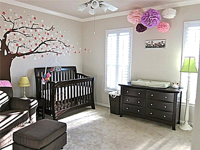
Dark wardrobes look interesting if decorated with contrasting vinyl stickers. Under glass doors you can put photo printing in the form of fairy tales. Bright soft toys landed in rows on shelves. Do not forget to add green plants to the interior - they should be located in light plastic pots out of reach, in addition, be safe from the point of view of toxicity.
Whatever style your interior is decorated in, remember dark furniture - not a sentence, but an elegant stylish detail. The main rule is not to occupy the entire living space with it, play with contrasts in the design of the walls, add bright little things.
You can send a request or message through the feedback form,
or call +7 (000) 123 4567, +7 (000) 123 4567.
09/09/2018, 13:11 Yaroslav
This may be interesting.
Some recommendations for choosing a color scheme for the interior
- Use no more than three colors: first select the primary color in which you feel comfortable. Already pick up two partners to him. The shades of the main color will be painted floor, ceiling, wallpaper.
- The interior, where the background color is 75% and the partners are 25%, is considered to be performed most correctly. The remaining 5% are bright color spots.
- We recommend choosing neutral colors for the background, and adding contrast with the help of accessories and furniture.
- You can choose pastel shades of blue, pink, peach, beige as the main color. But in such an interior you need to avoid splashes of black.
- The color scheme of the apartment can be the same or different for each zone. In the second case, it is necessary to ensure smooth color transitions from one room to another.
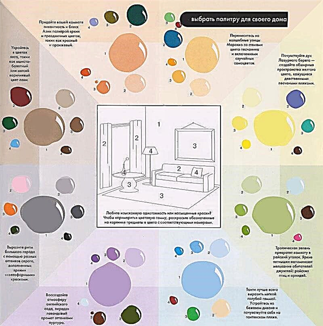
In conclusion, some great combinations to create specific looks.
Well, in five minutes of reading the article, you won’t succeed in becoming a professional in such a complex matter as the perfect combination of colors in the interior, but a few recommendations will undoubtedly help with the design of the house. And yes (if you are still thinking about it), a raspberry chair is perfect for lilac wallpapers. Or do you not think so?
More information in the section: Color in the interior
Color features
- Self-sufficiency - this color in any interior will become a dominant,
- Warmth - the more brown, the more comfort it brings,
- Versatility - it will look different in different interiors. It can vary depending on the lighting, on the surrounding background,
- It can be combined with many other colors,
- Well suited for both classic and contemporary styles.
- It can be used in the design of any premises,
- It does not cause fatigue. It gives a feeling of comfort and warmth.
When working with mustard, you need to consider some of its features. This is not a simple color and there are some rules for its application:
- There is a very limited list of colors with which he can act as a companion,
- With red, deep green and some other colors, it does not combine absolutely,
- It needs a spacious room and light, in a small room it will become dark, gloomy and stuffy.
What styles suits
Neutral color scheme is ideal for any stylistic trends. After all, it can be used as a basis or a discreet supplement. Suitable in the following styles:
- high tech. The optimal direction will be not a pure color of sand, but its colors: bronze, copper. The presence of such glossy inserts on the facades, stretch ceiling emphasize the originality of the direction.
- country. Kind and warm country is the best solution for home. Its basic design can easily be carried out in a golden brown color or its colors.
- chalet. Restrained chalet will not do without interspersing pastel colors. It will look good with wooden decor or decoration.
- Art Deco. Pastel color is suitable as a basis. But to dilute it in art deco is brown or black.
- classical. The use of golden brown pastels at the heart of the classics makes it easy to beat sophisticated furniture and decor.
- minimalism. A lightened pastel color scheme is a good finish for minimalism. As a complement, you can use brown or dark brown.

A new look at familiar things
Earth tones are back in fashion, including a variety of warm and elegant shades of beige or sand. This year, Africa will inspire paint on the walls.
Beige interiors, new trendy tones
In this post I will show you some interiors decorated with a beige color palette. New beige takes its shades from the desert, it is a warm shade with some yellow or purple content in the composition. To make it brighter and give it a texture, it is painted on the walls with various methods that make the color uneven.
Even considered a neutral shade, Beige does not fit all colors or materials, it must be combined with natural elements, shades and textures taken from nature. This is the perfect background:
- for plants
- for high-quality wooden elements,
- for green
- blue accents (soft greens, turquoise),
- antiques
- very tactile fabrics.
Earth tones are back in fashion, including a variety of warm and elegant shades of beige or sand
A drop of comfort in the family harbor accessories - curtains, paintings and elements of home textiles - will remind you of the warm rays of the setting sun, and at the same time make the sound of any room softer and warmer.
Clay accessories and home decoration
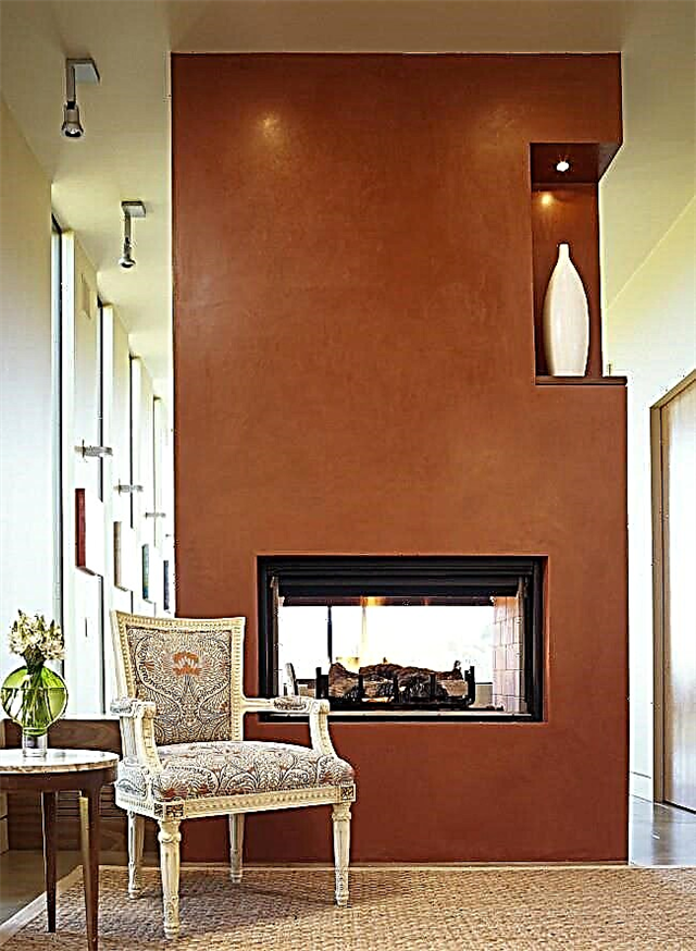
Terracotta color will help make the interior design bright. At the same time, he will not irritate his tired eyes after a hard day. Therefore, this shade is suitable even for a bedroom, giving it a warm atmosphere. However, for each room shades of terracotta should be selected individually, depending on the purpose of a room. So, for the bedroom it is better to choose more delicate shades, and when decorating the kitchen, you can stay at more saturated carrot and pumpkin options.
Terracotta color is recommended even by psychologists. This is the color of new impressions and positive feelings. It is positive in every sense and is considered to be the warmest and most harmonious in the color palette. Terracotta sets in a positive relaxing mood.
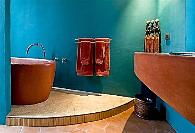
According to psychologists, the terracotta color will help you relax. The combination with turquoise in the South American bathroom
Terracotta curtains
When decorating a room, terracotta color can be used in curtains. At the same time, it is not necessary to maintain them in a monophonic range. This color goes well with a variety of options for drawings and patterns.
A bedroom dominated by warm shades of carrot orange and burnt clay
Advice! To make the decor more sophisticated, it is preferable to still withstand curtains in plain terracotta color. He will emphasize the aristocracy of the interior.
Aristocratic stone decoration and terracotta on the walls
Especially harmonious curtains of such shades will look with such accessories as:
- vases and flowerpots made from unprocessed clay or from material imitated in the spirit of ancient Roman sculptures,
- flower pots
- wall paintings.
Warm shades of ceiling light, runner on the table and accessories in the living room
This color will fit perfectly into the interior, designed both in the style of minimalism and in the eastern direction of stylistic thought. An equally relevant solution will be the use of terracotta shades when planning an interior in ethno-style. In this case, complement the interior with such accessories as: ivory animal figures, clay floor vases, African masks. As a result, you get an interior in safari style.
However, if you decide to dwell on the terracotta color for curtains, then you should correctly select the shades of other interior items. The most advantageous combination of terracotta curtains with the following shades:
Harmonious combination of different colors and shades in the design of Roman curtains
Decorative stucco in a natural color like this is one of the most successful solutions for nostalgic room design styles.
Advice! It is better to refuse to use bright colors in such an interior.
They are able to divert attention from the curtains, which are designed to become the "highlight" of the entire interior.
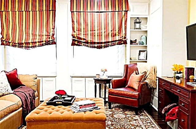
What colors perfectly match the beige color in the interior of the living room?
The beige color is considered to be a classic and it will look flawless with: terracotta, peach, red, purple, blue, yellow and even lavender. Any shades of it are perfectly combined with natural materials, i.e. instead of the usual wallpaper for decoration, it is better to use bamboo or cork, so any room will look creative and elegant.
There are many shades of beige, and if you plan to apply several of its shades when decorating a living room, then be sure to choose the colors so that their halftone is in the same color scheme. Even choosing the right shade of beige shades, it’s not worth decorating the walls, floor and buying furniture in the living room in one color scheme, because in this case the room will become very dark and gloomy. If you have already decorated the walls and floor in the “beige” color scheme, then you can “lighten” the room with milky shades of upholstered furniture.
Using neutral tones in the interior, you need to carefully think through the design with vivid combinations and bold accents. It is best to add a few black accessories to the “beige” room: a black table with chairs or a mirror in a black frame.
For a bedroom, beige is considered simply ideal, since it is it that helps to fully relax and unwind. In addition to all this, he is able to visually expand the space and make the room more comfortable. The combination of beige in the bedroom interior looks amazing with textured surfaces (bamboo wallpaper, unpolished wood, wool and fur).
To create a “royal” cosiness in the bathroom, add a little golden to the beige. Also in the bathroom, a beige shade will look great with silver, lemon peach, pink, green, blue and even scarlet.
To make the beige look stylish and “rich”, you need to bring bright accents to the interior, use paintings in bright frames, carpets with extraordinary patterns, or table lamps of an unusual shape. This color blends perfectly with gold, bronze and copper, as well as gray and lavender.
The beige-blue interior has long been considered the most elegant. These two colors can together create an original and unusual room design. This color scheme is especially relevant for large halls, offices and, of course, offices.
The combination of beige in the interior with white is also considered a classic. A room decorated in this color scheme will seem much larger.
A beige-gray interior is considered a great decoration.
When decorating a room in such tones, pay attention to the fact that there should not be more than three shades. You can dilute such an interior using a peach color that can bring freshness and originality to it.
The green-beige interior looks simple and elegant. Light green furniture will give the interior a special “zest” and bring freshness into it.
Beige color has always been and will be popular in many ideas of wall decoration, as it is ideal for interior decoration of rooms and blends perfectly with different shades. This shade can always be favorably emphasized with bright decor items (curtains, paintings, carpets, lampshades), or vice versa - create a cozy and quiet atmosphere that will not distract you from rest and peace.
With what to combine blue color in a bedroom style of minimalism. To get rid of dullness, add lemon-colored accessories and textiles with original embroidery to the overall style (it is better to use a striped or square fabric).
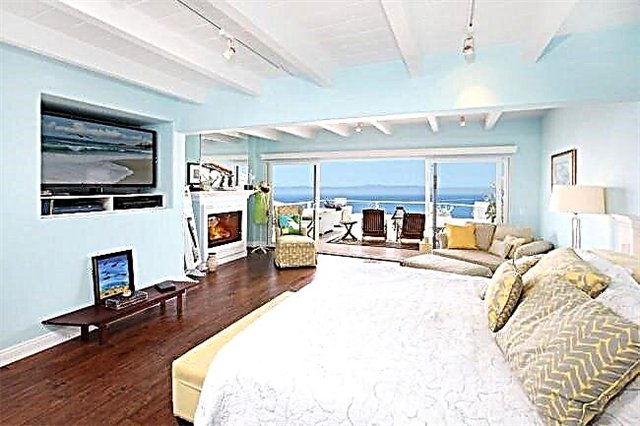
Spacious, airy white and blue bedroom with cream elements
Cozy bedroom in cream blue tones
Cream-colored bedding counteracts the chill of the blue walls.
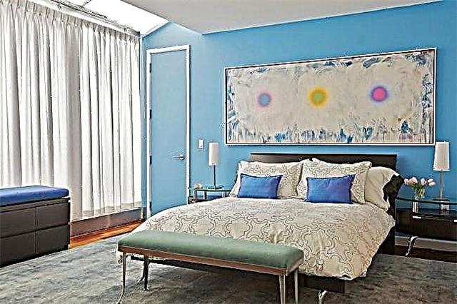
? The courage of black. In such risky and stylish combinations, a professional approach to the game of shades is required.Paint the celestial ceiling, include accessories in pistachio colors in the interior. Play bold color combinations separately, in different interior items.
A spectacular but very risky combination of black and blue
Black and blue interior of a modern apartment
? Classic white.? A favorite of fashion, white is always at the peak of popularity. Main palette: pale purple, forget-me-not, creamy, powdery with an emphasis on snow-white. To emphasize the style will help furniture of a classic form. For a change, change your textiles more often (use a polka dot fabric, a small square).
Fresh, light blue and white bedroom interior
In such a bedroom, in any weather, freshness will be felt.
? Freshness of lemon. Want a bedroom in summer, refreshing shades? Apply vanilla blue and pale lemon tones to the interior. Make sure that the colors are in the same, slightly muted range. This combination will “illuminate” the inside of the room, filling it with freshness. The stylistics will be emphasized by the use of fine ribbed fabrics and marine-themed accessories.