Wallpapering the walls is the most effective way to make the kitchen cozy and stylish and even fix some of the room's flaws. For example, with their help, you can create the illusion of space if the kitchen is small. The main thing is to choose the right shade and pattern for the wallpaper.
- The main guideline in choosing the color of wallpaper for the kitchen is the color of the headset. After all, it is walls and kitchen furniture that occupy most of the space.
Our guide will help you make your choice and will tell you some professional techniques for combining wallpaper and furniture. Also here you will find 112 photos of kitchens with wallpapers of different colors, in which you can peep ready-made coloristic solutions and ideas.
7 main rules
Whether you are planning a kitchen design from scratch or just want to replace the wallpaper to update the interior, these 7 recommendations will definitely help you.
- Make friends with the color wheel. Determining the color of wallpaper for the kitchen, you can use the favorite “tool” of designers - the color wheel. You can buy it in the store for creativity or search the Internet for its online version.
The principle of working with the circle is quite simple - you need to "play" with color combinations according to ready-made color schemes.

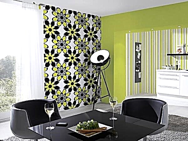
Scheme 1. Monochromatic combinations: colors from one segment of the chromatic circle are combined. That is, the wallpaper is selected in tone with the headset. So that the monochrome gamma does not seem too boring, it is better to choose a wallpaper with a picture (see photo below). You can also complement the interior with contrasting accents, an abundance of light colors or simply expressive textures / materials.

Blue kitchen with blue wallpaper with a pattern

Brown wallpaper without a picture in the interior of the kitchen
Scheme 2. Contrasting combinations: color-opposites are combined. So, for example, you can pick up a wallpaper with an orange print for a blue headset, since in a circle blue is opposite the orange. And so that the combination of contrasting colors does not seem too sharp, it is better to use complex shades (for example, in addition to a blue headset, you can choose not purely orange wallpapers, but terracotta ones).

Scheme 3. Harmonic combinations: “neighbors” are combined around the circumference. According to this principle, a green-yellow or blue-green hue should be selected for a green kitchen set. You can dilute this range by including contrasting or neutral tones in the interior.

We have listed three main schemes, but in reality there are much more of them (the principle of triads, distant pairs, intermediate tones, etc.). Below you can see some diagrams.

- If the kitchen does not have enough sunlight, then the wallpaper is worth choosing light and warm. For example, white, cream, creamy, light coral or pastel pink. Bright wallpapers of pure warm colors (for example, orange, yellow, red, etc.) can also be used, but in small quantities and subject to the neutral color of the headset. The photo below shows a successful example of how the northern and small kitchens were made lighter and "sunny" due to yellow wallpaper and white furniture.
What to consider when choosing a wallpaper
Today, the range of wallpapers is so great that it is sometimes difficult to choose the best option for your kitchen. It is necessary to take into account many factors that can both decorate, ennoble a room, give it additional visual space, and, conversely, exacerbate existing room defects. When thinking about the design for your kitchen, consider the following important points:
- Cold and light shades of wallpaper will visually expand the space of the room, and warm and bright - reduce,
- Large patterns bring the wall closer, and a small graceful print - moves away,
- Wallpaper with a horizontal strip or pattern makes the wall panels wider, but at the same time reduces the ceiling, while vertical images have the opposite effect. Walls with diagonal lines and patterns look special, giving the room a certain dynamic. Before buying, you should evaluate the geometry of your kitchen and, based on this, make a choice.
Using wallpapers of different shades, you can unobtrusively identify individual areas of the kitchen and make the atmosphere more diverse. Sometimes one dominant color is chosen and blotches are selected from its darker or lighter tones. In its own way, the look of the wallpaper is completely different in color and pattern from different walls of the kitchen.


Types of wallpaper for the kitchen
There are a number of materials that modern wallpaper is made from. However, you need to consider the features of the microclimate of the kitchen, with its increased humidity, pollution and temperature extremes. From this we conclude that we will need washable wallpaper, moisture resistant, with high light fastness. All these parameters are indicated by the manufacturer on the packaging.
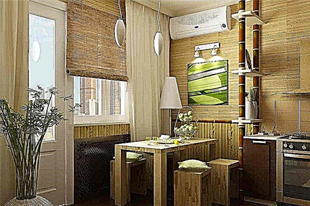
Paper wallpapers for the kitchen are categorically not suitable, since they do not correspond to any of the above parameters, unless you are going to paste them temporarily, for a short time. But you can safely trust the long-term repair of vinyl, non-woven, acrylic and glass. The original option that will make the design more interesting will be bamboo or cork wallpapers that can create a unique homeliness. They are among the most environmentally friendly materials that can withstand all the hardships of kitchen processes.

Color schemes
Undoubtedly, the color of wallpaper for the kitchen should be chosen at your discretion, because each person perceives this or that shade in his own way. But it is also worth listening to the recommendations of experienced designers who say that when buying you need to consider the location of the kitchen room relative to the cardinal points. For example, a kitchen with windows to the south, where quite a lot of sunlight comes in, needs to be “cooled” using cold shades. If you are the owner of a kitchen with windows facing north, you need to “warm it up” with warm tones of decoration, in particular wallpaper. Next, we rely on personal preferences and characteristics of colors from the point of view of psychology.
White wallpaper for the kitchen
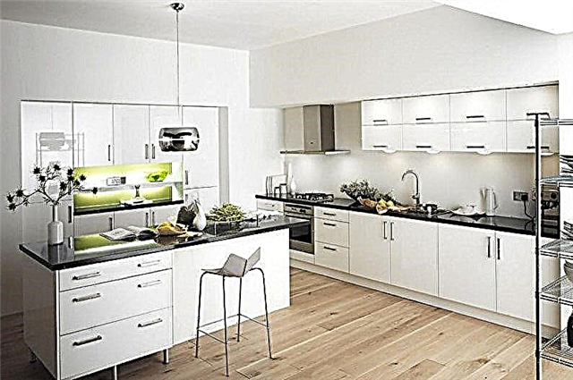
The snow-white palette makes the room as light and spacious as possible. Kohler symbolizes cleanliness and order, so it is ideal for the kitchen. A huge plus is that it is combined with any colors and shades, textures and drawings, therefore it often makes up the company to representatives of the rainbow palette. A plain version of white wallpaper can be found in a minimalist interior; in most cases, it is complemented by drawings that “revive” the walls and help to set the necessary accents. The design of the walls looks modern with wallpaper that imitates white brickwork or artificial stone with an admixture of gray inclusions.

Blue wallpaper for the kitchen
The blue color in the kitchen is an extraordinary design, which not everyone will decide. Although, if you choose the right shade using warm colors, you can create a relaxing environment that gives a sense of orderliness and security. It is also worth considering that this palette can reduce appetite, so it can be an ideal option for those who follow their figure, but families with children need to be more attentive to her choice.
You can paste the walls with sky-blue wallpaper or beige, white with an unobtrusive blue pattern, but designers don’t recommend wrapping a full box of a kitchen in a rich blue color, unless they design an accent wall. You need to choose a satellite shade taking into account the illumination of the room - if the room faces south, it is better to choose a cold tone in the neighbors, and a warm one is suitable for the north side. A great solution for a small room will be blue wallpaper in a dark strip, which will contribute to a visual increase in space.


Green wallpaper for the kitchen
The use of green wallpaper in the kitchen is a good solution that fits any size of the room. This color is universal - it fits perfectly into any existing style, has about a hundred shades with which you can adjust the space.
In addition, it is proved that green tones positively affect the psychological state of a person, improves appetite. When looking at the grassy palette, the eyes rest, and in the head there are a lot of associations with wonderful natural landscapes. Naturally look wallpaper with floral print, small flowers. Against such a background, furniture in cream and white tones looks good, as well as wooden surfaces, both light (birch, maple) and dark (walnut, wenge).


Red wallpaper for the kitchen
A rather extreme red color in modern design is gaining more and more popularity, harmoniously blending into fashionable styles. He is able to cheer up, endow a person with vital energy, increase efficiency.
The kitchen with red wallpaper in the morning will give a boost of energy for the whole next day. At the same time, it is not necessary to apply a rich scarlet color, it is even better to refuse it or use it in small quantities in the form of an elegant print, thin stripes. Preference can be given to burgundy or pink tones.
The design looks beautiful, where the wallpaper follows the pattern of the headset, as well as a plain dark red wall that can move the plane away, thereby expanding the space. It is necessary to take into account the fact that the red tone does not fit well with the tree, so when choosing a headset, it is better to lean towards white, gray, black glossy facades.


Yellow wallpaper for the kitchen
A wonderful sunny palette always pleases the eye, adding a touch of cheerful mood. The color has many shades - from cold lemon to bright tones of summer dandelion. For a small room, you should choose a lighter range, which over time does not begin to cause irritability. Any shade of yellow can soften the white palette, and the presence of sophisticated patterns will make the design easier, more airy.


Gray wallpaper for the kitchen
The gray tones of the finish can affect the mental state of a person in different ways. For example, light and medium soothe, and dark can cause apathy, so it should not be present in large quantities - it can be introduced as accent spots. The ash tone of the interior is ideal for kitchens facing south, as it is able to "cool" the environment. It will be a good solution for both the classic interior and the ultramodern. In addition, this is one of the most practical options that can be combined with any other color schemes and textures.

Interior Styles
Modern trends tend to design rooms in a certain style that is most sympathetic to personal preferences, temperament and lifestyle of the owners. In this case, the kitchen should also comply with the overall design of the living space. The choice of color and pattern of wallpaper can dramatically differ in a particular style decision.
Wallpaper for the kitchen in a classic style
Here, light, calm tones of the finish, such as beige, gray, cream, are appropriate. A unique atmosphere will be created by mother-of-pearl patterns, combined with a sparkle of silver and gold impregnations, and decor from gypsum stucco molding.

Wallpaper for the kitchen in the style of provence
Provence is characterized by pastel shades of design - lavender, blue, greenish, brightened pink. A special atmosphere of the French village will create vegetable prints, medium-sized images of birds and animals.

Color wallpaper for the kitchen - photos and ideas
You will see more photos of beautiful color wallpapers for the kitchen in our gallery. There are many examples that showcase the style. You will get acquainted with the best combinations of colors, options for selecting furniture for a particular tone of walls, which will help to create your own unique design in the future. Enjoy watching!
1. Modern geometric and color
2 main trump cards of wallpaper that distinguish them from absolutely all methods of finishing a kitchen:
- Complex, thin, clear lines that realize any geometric textures, abstractions and patterns.
- Transfer and combination of any colors in any quantities.
Of fashionable styles, this wallpaper design is widely used in Scandinavian kitchens for pasting the first accent wall. Or for Provence style, when the pattern is formed from flowers.
Tiles, cells, geometric shapes, but the main thing is color. All modern kitchen wallpaper options use dirty colors with low saturation. Why so explained in the material about the combination of colors in the interior.
2. Classical patterns and ornaments
A set of standard patterns with color motifs is used in classic kitchens and traditional styles.
It differs fundamentally by the contrast of the ornament to the main color - if the difference is large, it is used only as an accent option on 1 wall. With a small contrast of the picture, when the eye does not stop, you can paste over the entire room.
The most common mistake is the decoration of several walls of the kitchen with contrasting accent wallpaper with a pattern, especially when there are a lot of details in the interior without it.
3. Striped and checked
Wallpaper with vertical stripes (in a non-contrast version) and a check (in any) are suitable for kitchens in variations of modern classics and neoclassics.
Somewhat conservative option, but do not make a mistake.
It is very difficult to enter a contrasting strip into the interior and I categorically do not advise taking risks.
4. Screen printing
The interweaving of silver and gold threads for a characteristic shine is another 1 unique feature that you can’t get anything else.
Silk-screened wallpapers can be precisely applied in modern kitchens, for example under glass on an apron. But more often used in art deco and classic styles.
5. Solid
Most of the options from the previous 4 points are accented and are not suitable for small kitchens.
In real conditions, modern monophonic wallpapers are best suited for a small kitchen. They can have a discreet texture and some color differences that are indistinguishable from a couple of steps. In real photographs, distinguishing from paint is not always possible.
- For complex colors like dark blue, blue, brown, yellow, turquoise, etc. it’s difficult to color the paint and still have to do test colors on each wall. Wallpaper will give a clear color without surprises.
- Dark paint is impractical. Due to the white putty at the base, any scratch and chips are striking. Plus there is a "writing effect" when there are traces even from touching with clean hands. Dark wallpapers are devoid of all these shortcomings.
- If we ignore moisture resistance (this is the last point), then people strike more often, and animals scratch. Therefore, if you live without pets, the chance to damage the paint is greater.
- Wallpaper in the kitchen comes out trite cheaper, at least due to a simpler preparation for pasting (you do not need perfect alignment).
Immediately important remark:
For some reason I don’t understand, the most popular color for wallpapers is pale yellow (apricot or peach). For my taste, this is a dull boring color that should be avoided.
Wallpaper for white kitchen
It is deservedly the white kitchen set that is most often used and it is this color of furniture that I recommend: a white kitchen with a wood worktop.
White, beige and other pale next to white and especially glossy facades look dull.
Under the white kitchen, darker wallpaper options for contrast are suitable:
- Gray, dark gray and black.
- Brown colors of cocoa.
- Bright colors: green, yellow, blue, turquoise. Provided that the rest of the interior is not overloaded.
- You can use accents from the first two points of the material.
When choosing a wallpaper color, always look back at the kitchen area: the smaller, the more you should lean towards calm tones.
For example, it is obvious that red must be neutral, otherwise you will get porridge.
I do not advise
A whole layer of wallpaper to fit into the modern interior of the kitchen will not work with all the desire:
- Imitation of materials having a texture: under a brick, wood, stone, concrete, cracked plaster, 3D figures. Sometimes they look normal, but strictly from 1 point. It is necessary to change the viewing angle or see it under the light, and you cannot call them absurd otherwise. Below is a comparison of photos.
- Non-abstract drawings with rare exceptions. All these images of buildings, cities, clouds, bicycles, glasses and inscriptions will ruin your design with almost a guarantee.
- Small contrasting strips imitating it is not clear what. They were popular in the 2000s, it is better to leave them there.
Even if you qualitatively and realisticly depict a brick with all the shadows and volume on the wallpaper, in reality everything will give out lighting. You cannot fool anyone with this props.
Compare the photograph with a real decorative stone and its imitation - everything is clear from the first glance. In life even worse:
Collections and accent walls
Question: How many open walls in the kitchen that you can glue accent wallpaper on?
Answer: maximum 1, often 0. Consider:
- A headset is always attached to the first wall.
- On the 2nd window, radiator and curtains.
- On the 3rd door.
Those. in a typical apartment with a small kitchen, there is not always even 1 wall for bright wallpapers. Accordingly, there is no question of any combination of speech.
If you still have free, a non-standard layout or a kitchen-living room in general, then take a look at the ready-made collections. Usually, combinations are well-chosen there and the chances of making a mistake are less than with an independent combination.
An interesting idea: to stick accent wallpaper on an apron and protect them with a glass skinal.
Photowall-paper
I categorically oppose the use of photo wallpaper in the kitchen - too high functional load to make it so complicated.
Very rarely, this can happen more or less, if you build the entire interior from these murals:
But more often an eerie collective farm comes out.
And do not be fooled by photos from the Internet. Sometimes these are renders, not real photos. Or even a different finish. Below, for example, a fresco:
If you want to revive the kitchen wall - hang a picture. And leave the wallpaper with tulips in the past.
What wallpaper is suitable for the kitchen
Washable does not mean that you can literally wash. The conditional designation and different manufacturers make a different number of layers and materials. There are washable, waterproof, moisture resistant, resistant to abrasion, etc., but all this does not give 100% protection.
- No wallpaper can be glued in the work area. If the sink is near the edge, then the apron should always go on a perpendicular wall.
- If a dining table is attached to the wall, then either do not glue it there or operate it as accurately as possible.
From the point of view of environmental friendliness and toxicity, all foreign wallpapers pass strict certification and have no problems.
Washable and suitable for the kitchen
Almost all types have 2 layers: base and coating.
- Non-woven wallpaper. Both the inner layer and the outer of the polymeric material are non-woven - the most stable.
- Vinyl. There are with a paper base and non-woven. The second ones can be used in the kitchen, the first ones - no.
- Cullets. Fiberglass from interwoven threads. Commonly used for painting. Monotonous appearance.
In practice, waterproof non-woven wallpaper is easy to identify by bending the corner of the roll: non-woven more dense and flexible - there will be no crease.
If there is a visible bend line, then the base is paper and you definitely can’t use it.
Below is a table of marking options. Marked suitable depending on resistance to water:
Unsuitable
Because throughout the area, constant changes in temperature and humidity, nor on 1 wall of the kitchen can not be used:
- Acrylic
- Textile (fabric)
- Natural (bamboo, etc.)
- Vinyl, non-woven and generally all wallpapers with a paper base
- Liquid (they are outwardly bad)
I hope you found a couple of interesting ideas, good luck in the repair!
Fashionable shades
Specialists and professionals in the field of design will best tell you what colors of wallpaper are suitable for the kitchen. Just look at the photos of stylized interiors - and it will become clear whether the selected type of wallpaper is suitable for the kitchen or is it better to replace such material with something simpler. So before you go looking for suitable wallpapers for your walls, look at the information about which designs and shades are popular this year.
Today's trend is a parade of contrasts. The interiors are becoming more colorful, and even the kitchen did not pass such an emphasis.
Bright wallpaper for the kitchen is a great opportunity to add variety to a simple interior, saturate the room with fresh colors and create an atmosphere that would set up an appetite.
In both modern and antique kitchen interiors Brightly colored wallpapers are used primarily as accents on individual walls.. It can be coatings of yellow, orange, purple, light green and other colors.
What color wallpaper on the kitchen is no less popular recently? Suitable pastel shades include soft pastel colors: wallpapers of this type emphasize home comfort and are often used to distinguish between the working area and the dining room.
The Scandinavian style is also in fashion, and, therefore, the white color of the wallpaper will look no less impressive in your kitchen. When creating a design with the help of easily soiled shades, use a wallpaper with a washable texture.
No less popular colors of wallpaper for the kitchen - black and white, beige, mint. Cold-colored wallpapers are also in demand, but such interiors are complemented by bright textile accents or a rich palette.

How to choose a suitable color
Among the whole variety of color options relevant this year, it is better to choose the appropriate wallpaper for the kitchen, taking into account the specifics of your room. So, in a cramped room it is undesirable to glue background wallpapers of darkened colors: they create a gloomy atmosphere and contribute to a visual reduction in space, and you can not fix the crowding effect even when using a minimal amount of furniture in the interior.
If your kitchen is spacious enough - do not make it wider, using light and cold shades of wallpaper for walls. Such a room will not be taken comfortably: better to use several colors at once, which will harmoniously complement each other.
An important role in the selection of suitable shades for decoration will play and the illumination of the kitchen.
If the room faces the north side and is poorly lit in the daytime - compensate for the lack of bright light using a wallpaper of a soft and delicate palette: white, light blue, yellow colors will suit you.
Bright rooms are allowed in the southern rooms, as sunlight can draw attention to the brightest walls of your interior.

To determine which color of wallpaper is best for the kitchen, take into account the degree of contamination of the walls in the decorated area. For this reason, dark wallpaper or bright patterned materials masking stains on the walls are most often glued in the cooking zone.
In addition to the above factors, pay attention to the color of the headset and accessories. Contradictory colors cannot be used to create a single and holistic design.. Therefore, ideally, the headset should differ in color from the background by only a couple of tones.
Pastel colors of wallpaper and dark materials for walls are suitable for light furniture. The headset is white or beige color to dilute the gloomy atmosphere.

If you installed dark and massive furniture - lighten the design of the room as much as possible with the help of wallpaper in delicate shades. Curtains, rugs, paintings on the walls and other accessories should not merge with the background, but should not cause contradictions, therefore stick to a single palette, but choose colors of different levels of saturation.
It doesn’t matter what type of wall decoration you are looking at: combined designs and interiors using one type of wallpaper for walls are considered fashionable today. But when choosing a color, it is important to realize what kind of atmosphere should be created in the kitchen space.
If you plan to emphasize warmth and homeliness, the shades of the walls should be appropriate: in this case, pink, peach, beige, yellow wallpaper for the walls will suit you. Brighter shades will create a feeling of triumph, and cold and calm tones will be more suitable for those styles that should be perceived strictly and concisely.
We will find out which wallpaper for the kitchen to choose for the most common style directions.
Choosing a wallpaper according to the style of the interior
You will choose the style of kitchen design long before buying wallpaper for walls, as any transformation should begin with furniture. But, despite the fact that wallpaper for furniture is much easier to choose, it is not always possible to accurately guess the essence of a particular direction.
Therefore, we suggest that you now find out which wallpaper is best for the kitchen, depending on the supported style:
- The interior of the kitchen in the Art Nouveau style should be created using bright colors. You can use wallpapers of orange, green, purple, combined with lighter,

Most often, in studio apartments, the kitchen interior is connected to the living room. Take a look at the photo of the wallpaper for the kitchen with the living room: usually they are selected taking into account a single palette, but have a different design.
You can use different shades to zone the space and delimit the area of the hall and the kitchen, but in this case only one color should be accented (bright or dark).

Variants of bright ideas for wall decoration
More often in kitchen design, not monophonic wallpapers are used, but coverings with patterns and realistic images. They play both a practical and aesthetic role: they mask the imperfections of the walls, hide spots, create a bright color scheme of the room.
Since it is undesirable to create a background of saturated colors in the interior of the kitchen, it is better to glue the wallpaper for the kitchen with a pattern on one of the walls as an accent. It can be images of a wide format or narrow inserts as an apron or a decorative panel.
Among the most relevant options for wallpaper in the kitchen, one can single out the use of plots with fruits, elements of nature, or kitchen utensils. Coffee wallpapers for the kitchen, abstract ideas, and urban themes are also popular.
Coffee wallpapers for the kitchen are suitable for creating a bright accent in both antique and modern design.
Large patterns with coffee beans or drinks can be pasted next to the dining table. Photowall-paper of the small sizes is better for sticking in a working zone.

Fans of natural accents will appreciate finishing materials with a design on a natural theme. Colorful and vibrant murals with elements of nature and landscapes can be placed on any of the free walls.
In poorly lit kitchens, wallpapers with light and bright colors are popular. Wallpaper for the kitchen with sunflowers, roses, tulips and other flowers will harmoniously fit into the interior of any color scheme.

When choosing wallpaper for the kitchen, you can focus on more modern design options. It can be colored and monochrome murals with images of famous architectural masterpieces, river bridges, street alleys and other elements of an urban theme.
Wallpaper city in the kitchen always look stylish and original, as they imitate the view from the window or the continuation of the space of such a room.
Fruit design is especially in demand today: juicy and vibrant shades of fruit make the kitchen interior more lively and dynamic, awaken and energize. Such a design of the walls will be appreciated by both the hostess herself and the guests who will gather at the kitchen table.
They will find application both on the whole wall, and on its separate part: for example, in the photo you can see wallpapers with apples for the kitchen, used instead of an apron.

Now you know that there are many color ideas that will not violate the purpose of the kitchen interior, but will make it stylish, modern and cozy.
Make up your mind to paint your walls in more refined shades: we hope that our recommendations helped you decide what color to paste the wallpaper on the kitchen.